Sunday, April 5, 2020

Experiment 2

Exp 2: A Facelift For The School of Architecture

Cross Task - found in earlier blog post.

Week 1

Article Task:

Key words: Canvas, Landscape, Community, Connection, Porous

Great architecture has an innate ability to draw on the canvas of a landscape and create something magnificent. In doing so, this work should build a connection between this landscape, its context and the community who are exposed to it. This architecture should form a harmony between the organic and the mechanical, "(a) porous cellular arrangement", to bring create exciting spaces that people engage with.

Reference:
 Laura Harding. "Defiant and spirited: The Architecture Symposium, Brisbane". ArchitectureAU, 2020. <https://architectureau.com/articles/the-architecture-symposium/>


Week 2

Plan exercise:

Mies van der Rohe Skyscraper:


After tweaking with the plan, I came up with the below form. This was used as inspiration for my school design:


Designing the School:

My initial plan for the placement and identity of the school:

The process of design is often lengthy and features many changes. As seen, I had initially planned to situate my bridge as an external aspect of my school, granting access to higher floors in the form of a ramp. 

Early concept design for central support for the bridge. This will support the raised structure via radial angled struts.

After some feedback from peers and my tutor however, and following inspiration from the plan activity above, I chose to undergo a large redesign of my design. This is shown in the updates below.

Further development of the school

This revised form was developed from the segmented style of the hexagonal structure above, which i morphed into a more triangular oriented shape, inspired by Mies van der Rohe's work explored above.


Using this model, I have developed the following as my new rough design:


Perspective Drawing Task:

Axonometric front view animation: a rough model of 1 of my 3 school buildings and its attached bridges.

2 Point perspective animation: rear view of the above structure.


36 Textures Task:

Unlike my hand drawn style I explored in the first experiment for ARCH1101, I chose to use a digital medium on my phone to draw my textures for this task. I felt that although probably more time consuming, these textures turned out far better than my hand drawn efforts earlier in the trimester.


Adding to my model:
 
In the above image, I have added in one of my 'Random' textures to provide a change of texture in some of my bathroom entries. Placed on the entrance privacy wall, this recessed plane serves as a good medium for such a bold texture.

 
A 'Linear' texture was added to the student labs at various workstations, again changing the textures of the space through and interesting and eye catching medium.


Additionally, the above 'Flowing' finish was used to frame the lecture hall's presenting surface. This helps to add a border to projections onto this plane.


Tuesday, March 17, 2020

Experiment 1 Part 2

Week 3 Tasks:

36 Textures:


The three textures which can be found within my model are 'Shiny', 'Reconstruction' and 'Molecular'


2 Client products/works which have been embedded into my model:


These textures, alongside the above clients' work when incorporated into my SketchUp model:


The texture 'Molecular' was incorporated into the water feature on the lower arch in my design. I found this gave an interesting juxtaposition to the prior dark fixture, and also somewhat resembled the shapes seen in a water outlet. It was used on top of this feature too, matching the aesthetic of Trent Jansen and his inherently rustic appeal.


Sparkle was used as a representation of a decorative floor light, and reconstruction added an interesting texture to my staircase which i found to match the modern aesthetic of Khyzyl Saleem.


10 Second short video:

I chose the notion of crashing waves as a major inspiration to my design, and as such found this video a great reflection of my architecture.

Week 4 Tasks:

3 perspective images of my model:


3 Sectional Perspectives:
(note that due to the offset and open nature of the site, traditional sectional perspectives did not turn out well, as cross sections of most surfaces can already be seen.)

Top view of the below ground facility.

Side View

Front View

Please note: the intent for my below ground space was for the effect of water running over this glass dome, and thus creating more of the "borrowed space". I persisted with this notion, however could not find a visually pleasing effect.


Sunday, February 23, 2020

Experiment 1 Part 1

Prior to Week 1:

3 Images:  

Image A: Own Creative Work
Above is the drawing in which I see as my finest creative work. It is a depiction of the interior of the Paris Opera, as part of an architecture assignment from an earlier subject. I like how I was able to capture depth and shadow in the complex and rich space.

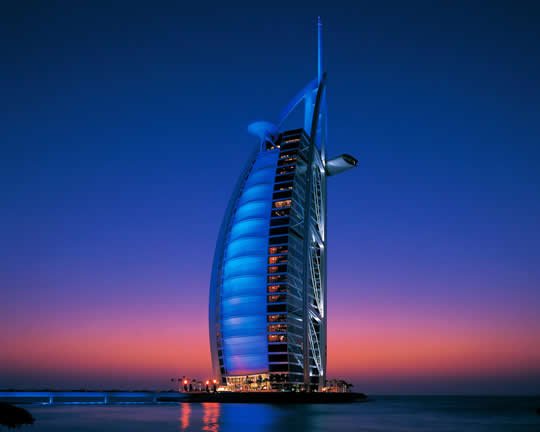
https://worldtoptop.com/wp-content/uploads/2013/07/Burj_al_arab.jpg
Image B: Burj Al Arab
This building is one of my favorite pieces of architecture due to how it interacts with its surroundings and landscape. The sail like structure is inherently maritime, and not only contrasts to the arid climate of Dubai, but resonates with the sea around it.  


Image C: Sunset over Japan
I took this image in early January 2019, while traveling in Japan. I think it was the best image from the trip, and definitely a stand-out from my usual amateur photography skills due to how it captures the sun glistening off the architecture.


Week 1: Meeting the Clients

Inspiration:
Based off the following 3 chosen images, we were assigned our "clients". They were then described using 3 key words, which would become a focus of our later tasks and architectural designs.
Edge... Modern... Brighten
   

Imperfection... Classical... Flowing
Cleo Gold Snake Earrings. Egyptian Style. Cleopatra. Bold statement jewellery. Mountain & Moon. Australian Jewellery Design. Ethical Fashion. Gold.
Reptile... Twisted... Transient


18 sketches
Using two of our above clients as our focus, 18 'design spaces' featuring an above and below ground studio were developed: 

.         


.     


SketchUp Model
One of these was then preliminarily modelled in 3D using Sketch-up:

.     


4 Staircases
Following this, we were tasked with creating 4 original staircase designs which were to be inspired by our chosen client words, eg. imperfection. We were then tasked to model one of these on Sketchup:


From these, I chose to use my design for 'Imperfection':


The above staircase was as mentioned, modelled using "imperfection" as its inspiration, for the use of my clients at Trent Jansen Studio. During the designing process, I wanted a stair that could not only look unique, but be functional. As such, the staircase was designed to feature an irregular cadence of treads and risers, which not only catch the eye due to their 'imperfect' nature, but also serve to allow light to pass through to the below floor. This allows for the below level to be used as part of Trent's workspace, this natural lighting typifying their unique and somewhat earthy aesthetic.